Smart Responsive Design Patterns & Front-End Techniques

Full-day workshop • April 7th
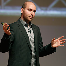
In this full-day workshop, Vitaly Friedman, editor-in-chief of Smashing Magazine, will present practical techniques, clever tricks and useful strategies you need to be aware of when working on any responsive design project. Most techniques are borrowed from mid-size and large-scale real-life projects, such as large e-commerce projects, online magazines and Web applications.
We'll be looking at specific techniques for building well organised, front-end software, and wherever possible this work will be hands-on. Vitaly will introduce theories and ideas for dealing with common problems, and attendees will be assigned small tasks so they can experiment for themselves with these techniques. This will be involve a mixture of both individual and group work. There will be plenty of time allocated to discussions, so we can make sure that everyone understands how they can apply what they've learned to their specific working environments.
In this workshop, you'll learn:
- Effective tools and techniques that can support and enhance your personal workflow when working on any responsive design project,
- An overview of clever practical techniques for improving UX as well as performance of responsive sites,
- Front-end strategies for scalable, resolution-independent graphics and maintainable CSS code,
- Responsive Design Patterns and innovative approaches to designing "responsive modules" such as tables, calendars, multi-level menus, maps and Web forms,
- Testing, debugging and maintenance techniques for responsive sites as well as lessons learned from Smashing Magazine's own redesign and performance optimizations,
- How to manage legacy browsers and deal with Internet Explorer 8 and Android 2.3 in responsive projects,
- Technical issues (and solutions) for responsive advertising and responsive email newsletters,
- How the design processes should adapt in terms of the project management, deliverables, performance budgets, team organisation and strategy.
This workshop is intended for professional designers, developers and everybody else who is dealing with responsive design regularly or wants to better understand responsive design in general. You should at least be familiar with some basics of responsive design, HTML5 and CSS.
What hardware/software do you need?
To get the most out of the workshop, you'll need to bring a laptop with your preferred text editor.
Location
This full-day workshop will be hosted at the Fort Mason and will take place after two days of SmashingConf. The workshop will be running from 9:00am-5:00pm on Thursday, April 7th. You can register online and save over $100 when you sign up for all three days.
- On the Web
- http://smashingmagazine.com
- On Twitter
- @smashingmag
- Workshop includes
-
- Snacks and drinks during the whole day
- Tea and coffee
- Lunch
- Paper and pen/pencil


