 13th–14th of June 2017
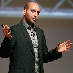
New Front-End Adventures in Responsive Design
Full-day workshop • June 15th
With HTTP/2, Service Workers, Responsive Images, Flexbox, CSS Grid, SVG, WAI-ARIA roles and Font Loading API now available in browsers, we all are still trying to figure out just the right strategy for designing and buildings responsive websites efficiently. We want to use all of these technologies and smart processes like atomic design, but how can we use them efficiently, and how do we achieve it within a reasonable amount of time?
In this workshop, Vitaly Friedman, editor-in-chief of Smashing Magazine, will be looking into a strategy for crafting fast, resilient and flexible responsive design systems by utilizing all of those wonderful shiny web technologies we have available today. We'll also talk about dealing with legacy browsers and will cover a few dirty little techniques that might ensure that your responsive websites will stay relevant, flexible and accessible in the years to come.
In this workshop, you'll learn:
- responsive design patterns and innovative approaches to designing "responsive modules" such as tables, calendars, mega-drop-downs, dashboards, maps, forms, lightboxes and filters,
- architecting and building pattern libraries, style guides and design systems,
- content choreography, internationalization and localization issues,
- layout techniques (Flexbox and CSS Grid),
- resolution independence (SVG Gotchas),
- compressive and responsive images (optimization and techniques),
- web font loading strategy (options, strategy, code snippets),
- deferring and lazy-loading JavaScript,
- performance issues/strategy (best practices + HTTP/2 + HTTPS + prefetching techniques), including transition from HTTP to HTTPS,
- Service Workers, how to make use of them and how to keep maintenance sane,
- maintenance issues (e.g. dealing with legacy browsers),
- common front-end challenges and solutions,
- accessibility issues and techniques,
- gotchas when building responsive HTML email newsletters,
- tooling (performance, frameworks, testing, quality assurance).
This workshop is intended for professional front-end designers, developers and everybody else who is dealing with responsive design regularly or wants to better understand responsive design in general. You should at least be familiar with some basics of responsive design, HTML5 and CSS.
What hardware/software do you need?
To get the most out of the workshop, you'll need to bring a laptop with your preferred text editor.
Location
Microsoft Technology Center
11 Times Square, 5th & 6th Floor
(Between 41st & 42nd Streets on 8th Ave.)
New York, NY, 10036
Google Maps
Schedule for Monday, June 15th
8:30am – Doors open, Registration
9:00am – Introduction & Kick-off
11:00am – Coffee Break
12:30pm – Lunch
1:30pm – Afternoon Session
3:00pm – Coffee Break
5:00pm – The End, Networking
Save $100 when signing up for the conference and a workshop!
- On the Web
- http://smashingmagazine.com
- On Twitter
- @smashingmag
- Workshop includes
-
- Snacks and drinks during the whole day
- Tea and coffee
- Lunch
- Paper and pen/pencil


